In hotel photography, there's a lot of work that goes into creating just one image. Set-up and styling of a guest room can easily take 30 minutes and often longer, depending on the size of the room and how prepared it is. Furniture may need to be rearranged, wires and cables should be removed or hidden, and pillows need to be fluffed and set.
The process of actually shooting the room can also take some time. All of my guest room images are created as a composite of many different exposures, sometimes reaching over 30 in number, so shooting for half an hour or more is not uncommon.
However, post-processing is where most of my time is spent when creating images for hotels. I can easily spend several hours editing just one image. Because I'm using such massive images, I can dig really deep into the details and retouch on a pixel level, which makes every image look natural and not heavily-processed.
Here's a quick video of some "before and after" images from several hotels I've shot. You can see what a normal, unedited photo of a guest room looks like before it receives all of the required editing, followed by the final product.
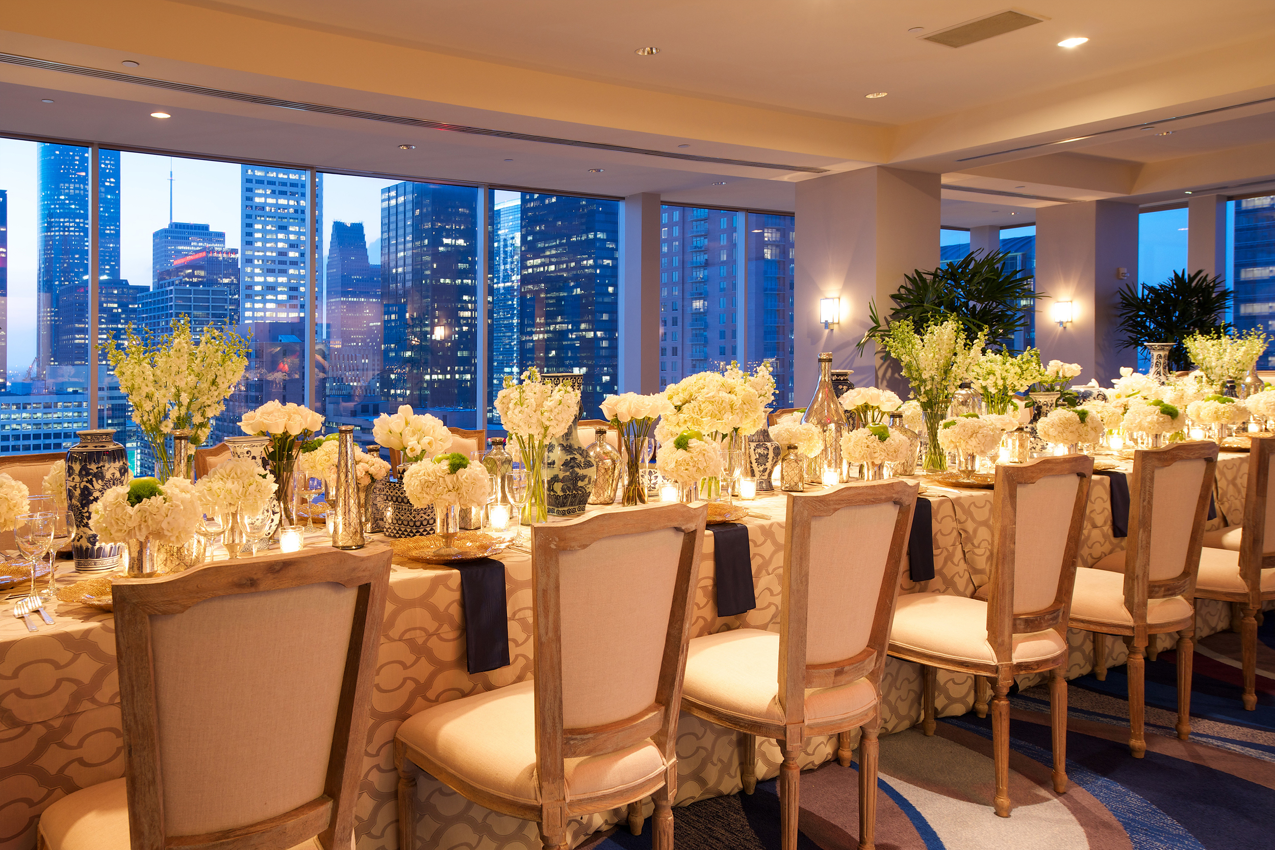
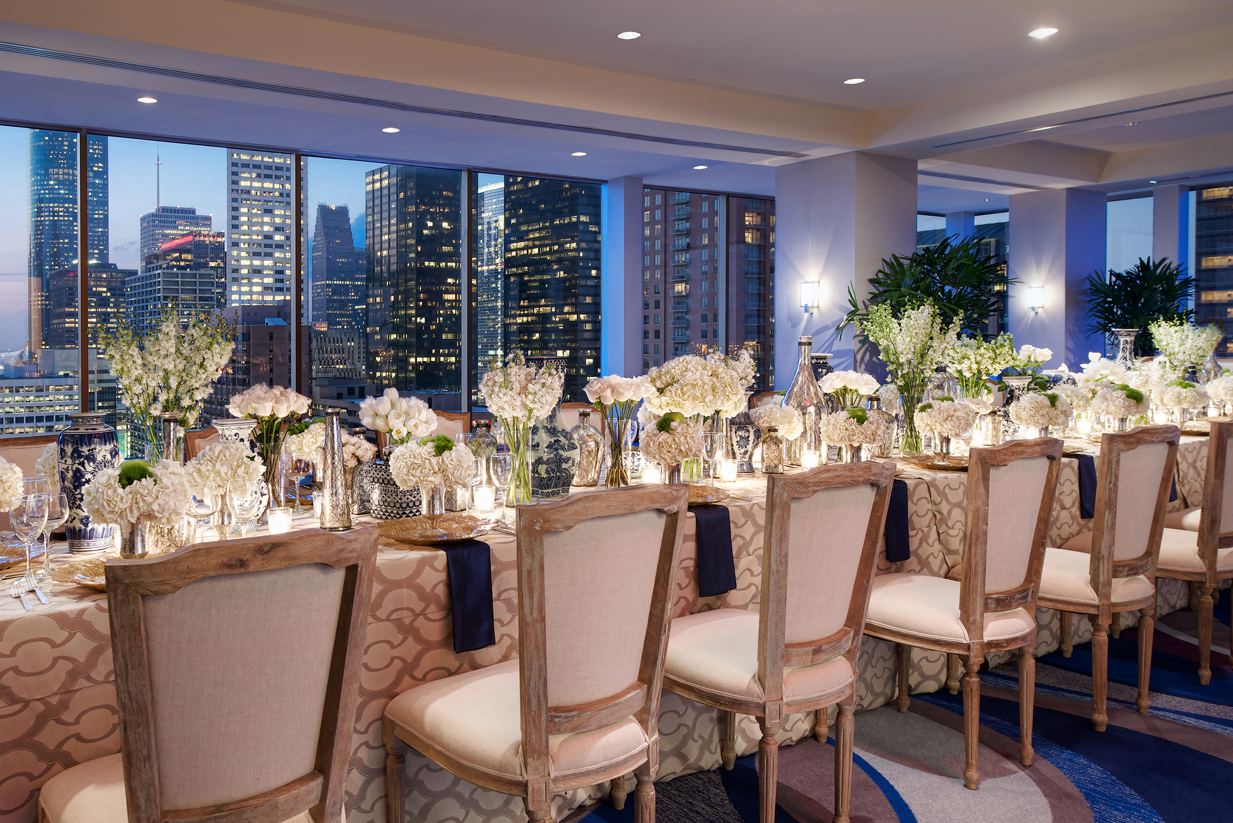
Here are some of the still images used in the video. The first thing you'll probably notice in this example is the view out of the window. Many luxury hotels have nice views that they want to show off, so it's absolutely crucial to capture them. If a hotel photo has a window with a blown-out view, either it was intentional or the photographer was simply too lazy (or unaware) to edit properly.
Example 1
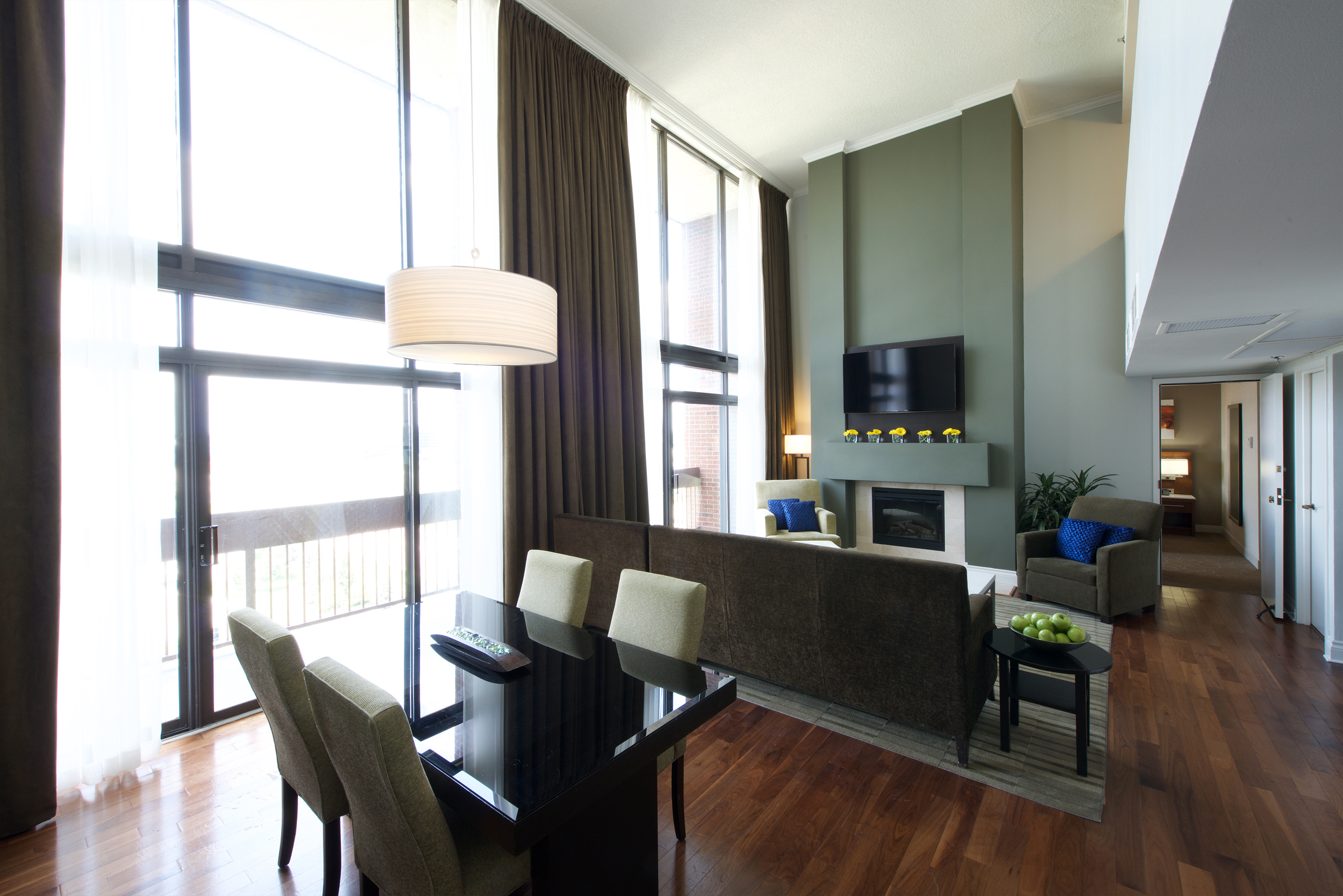
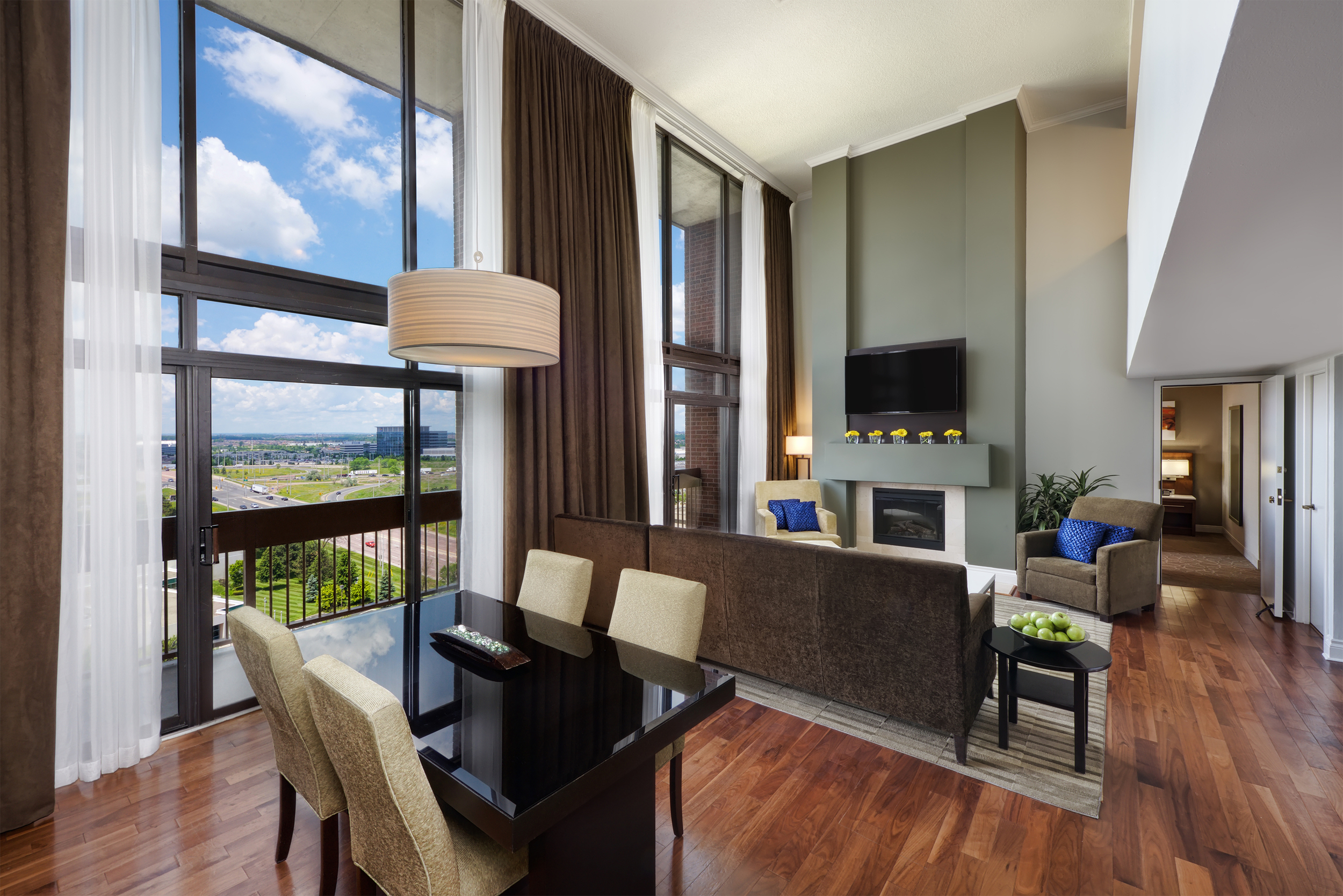
Another area where many hotel photographers make mistakes is with white balance. Too often I see photos that appear way too cold or hot in certain areas. In the examples below, the camera couldn't decide what temperature to shoot at because of the different lighting inside versus outside. The temperature it went with was too warm for the interior and too cool for the exterior. This needs to be repaired in post-processing in order to get a perfectly even white balance throughout the image.
Example 2
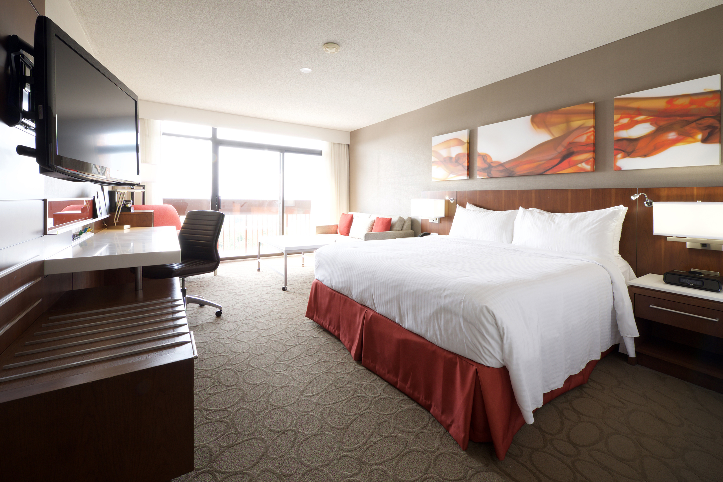
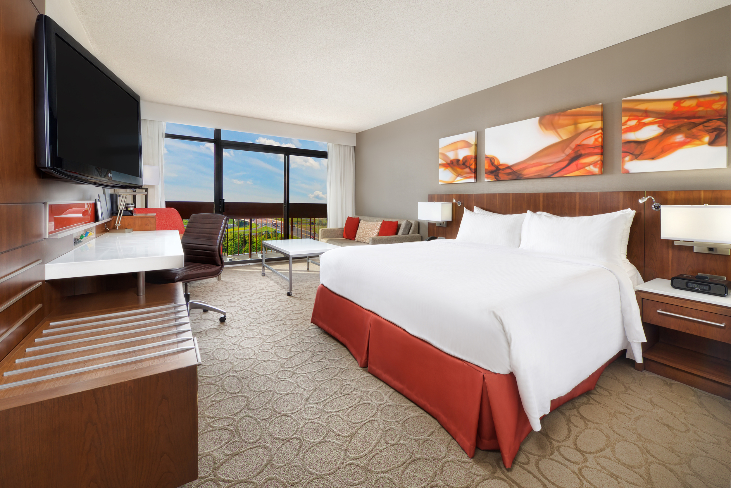
In the last example below, you can see several major edits: the view, the wrinkled linens, and the glares in several places (on the TV, the wooden panels, and the wall above the sofa).
There's no reason why any good guest room image should have wrinkled bedskirts, sheets, and pillows. It does take some time to remove these, but if they're not taken care of, then it's the first place the viewer's eyes will be drawn to when they look at the image. I like to leave some wrinkles and creases so that it still looks natural, but any of the distracting ones should be cleaned up.
Glares can often be distracting as well. I use a combination of natural and artificial light for most of my images. In this case, the natural light was creating some major glares on the TV and wood paneling, so I used some heavy flash to eliminate them.
Example 3
There's a lot more that goes into processing hotel images than what I just covered, like lens distortion and non-vertical lines. I don't think many people realize how much time actually goes into making the images that are used for hotel websites. (Well, some of them, anyways!)
Hopefully, I've shown a little bit of what's possible at any given hotel property, and also what should be expected from any decent hotel photographer. And if you're a hotel representative and your pictures look like the "befores" in this post, then it might be time to start thinking about a reshoot!
